Tuesday, April 12, 2011

Rachel O. | Portraits

Rachel is my old roommate, and is graduating from college next month! So, she asked me to shoot some senior pictures... to which I gladly accepted! Enjoy!


Friday, April 1, 2011

Light.

Our third project was to create a piece about time and light. I chose to incorporate this quote and electricity. I also then took into After Effects and animated it!

Monday, March 7, 2011

Stuck.

This is my second screenprint for the semester. We used emulsion and mylar with ink drawings - the next project will be with transparencies!


My chosen object/content for this semester (in this class) is a typewriter - if you hadn't figured that out already. I love typewriters, and have always loved writing letters and having penpals. Except for the fact, that having to write letters means that whoever you're writing to (who you probably are very close with) is far away. The people I write letters to the most are my boyfriend and best friend, who both live faaaaar away (in really awesome places, I might add) - while I'm stuck here. 

Sunday, March 6, 2011

Alex G. | Portraits

I had to shoot some pictures for a photography assignment, and needed some bodies. Alex said she would love to, so we drove around town for about an hour. So fun! Can't wait til next time, Alex!


I love this candid one of her laughing... 


Have to throw some fun in there too! 


This burned down house was soooo beautiful (and slightly dangerous!)
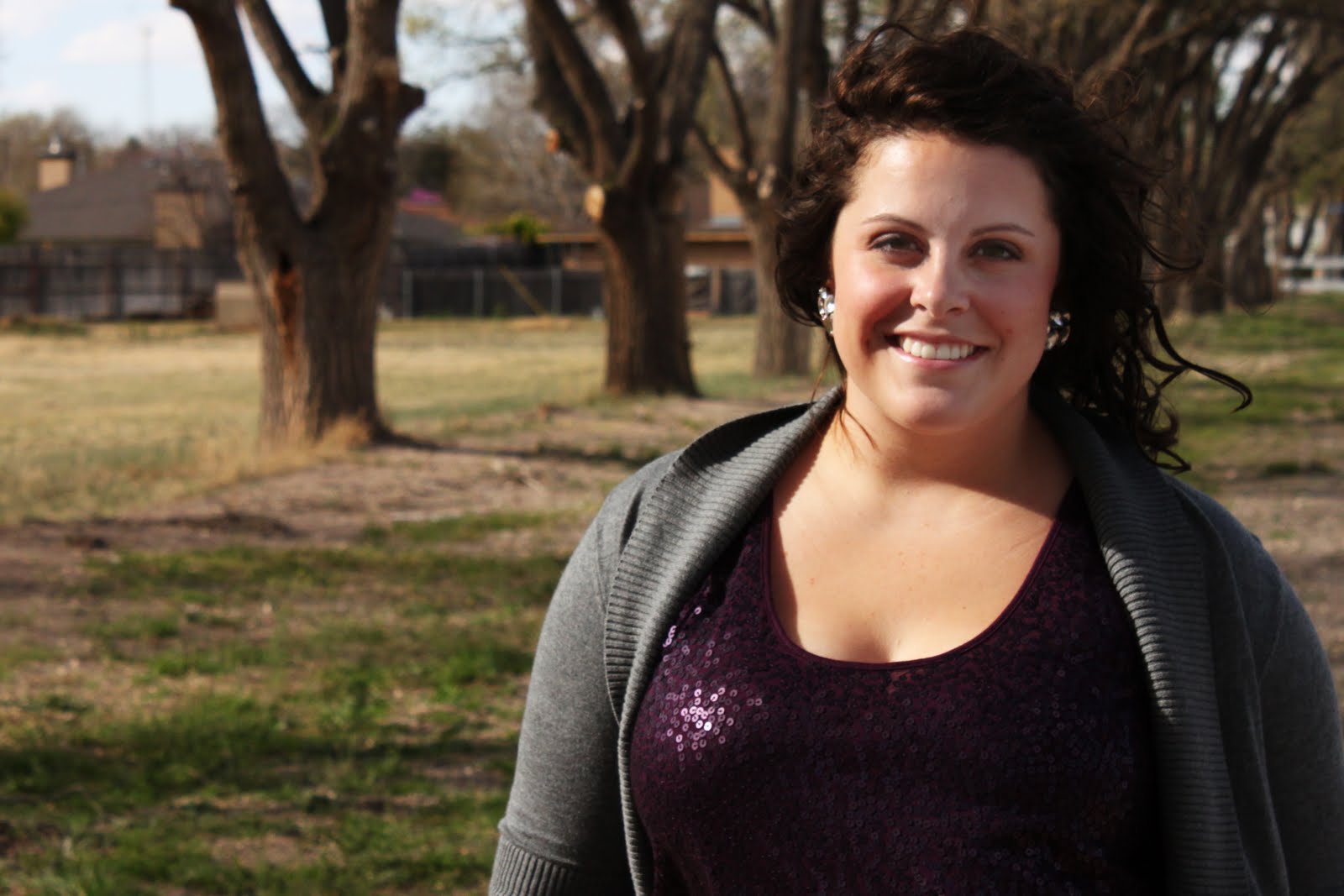
Tyler S. | Portraits

Had a small photo adventure with a good friend of mine...


Tuesday, March 1, 2011

Ogallala.

Our second typography project was to create something about the Ogallala Aquifer (most did a poster, but we were allowed to do other types of design). I had a leftover piece of paper with a watercolor stain on it, that I incorporated into the text for my poster. I erased some of the image/text to represent the aquifer drying up.

Sunday, February 13, 2011

Punchcard.

For our first project in typography, we had to create a type face that would fit the name "Punchcard." I thought of all the cards we get punched in stores, after you buy so many things or spend a certain amount of dollars. It's usually some kind of bold font, or thick shape - which is why I chose to use this particular font. Then, I took a small triangle chunk (or a few) out of each letter/number! This is the font applied onto a box template!